Out of all the choices from the Linguistics categories, I became interested in learning about the history of languages and how it evolved as humans developed. I find that when it comes to research, by default I like to look into the history of the subject as I feel comfortable knowing the general understanding why something is the way it is now from how it evolved over time. I feel that this makes me comfortable in learning about the subject theme as it gives me something to subconsciously refer back to when understanding what makes it that. Abley, M. (2005) Spoken here: Travel among threatened languages. United Kingdom: Arrow Books. Crystal, D. (2014) Language death. United Kingdom: Cambridge University Press. Janson, T. (2002) A speak: A short history of languages. United Kingdom: Oxford University Press. The reason why I chose these three books to originally research from were due to because these were the only three books of the 417 category available at the time in the Millennium Library at the The Forum.
Due to prioritising my time to finish the Fine Art Collaborative at that current time because of the shorter deadline, I only managed to read the book above efficiently as it was the one that I think had information that I wanted to know about linguistics. The notes I pointed out above were facts that I found intriguing from the book. I think these are things that people aren't aware about even though it's the development and evolution of something we all use to communicate everyday. Using these to develop further could be something we use as an educational sense for people to learn from our future event.
0 Comments

As a group we gathered a broad range of research about linguistics. Although I found my category interesting to read about, others felt unimpressed with theirs and preferred the approach to sign language. I think sign language would be easier to take forward as it has a more visual aspect to it rather than words, therefore making it easier to produce visual artwork for the subject.
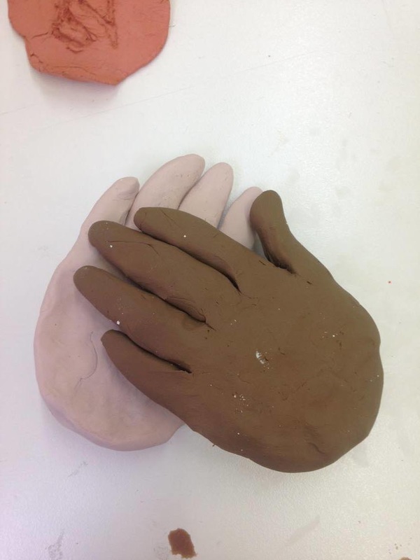
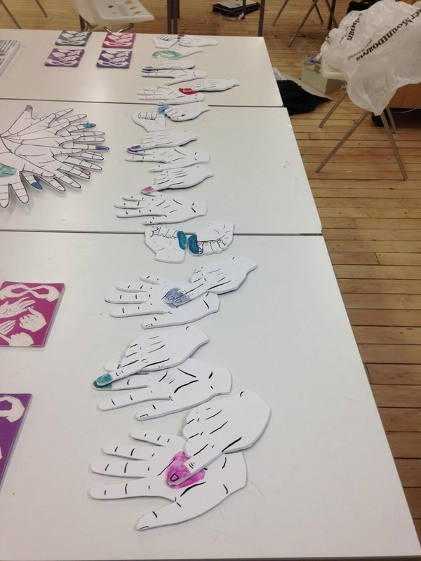
We received some positive feedback about our display of research and some good notes on how we could possibly take it further. A general census was that the sign language proved to be most successful that people were intrigued by, as well other ways of communication that is non-verbal.   Marcel Wanders Pinned Up 2014 In response to the brief for the 3D Model Tableau, we agreed to narrow our research to sign language. I still wanted to try and incorporate what I had learnt from my research as a possible route to take and decided to experiment with carving; an old format for writing. As a group deciding how we could display some 3D sign languaging, I remembered this piece above by Marcel Wanders from his Pinned Up exhibition that I visited at the Stedelijk Museum in Amsterdam 2014. Chloe had been experimenting with mod rock in her fine art collaboration, so as a group decided to use sculpted hands for our display.
So far as a group, we're collaborating and bouncing ideas of one and each other well. I feel that we're going to produce some productive and innovative work. 
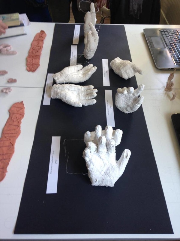
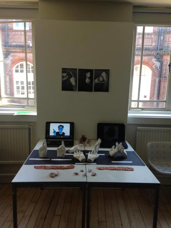
Clay Carvings - Linguistics written in Heiroglpyhs (top) Anglo-Saxon Runes (bottom)
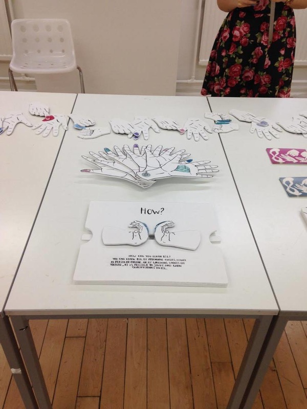
Mod Rock Hand Moulds - Who, What, Why, Where, When, How.
Plasticine Alphabet from Chloe Dennis on Vimeo.
Plasticine Hands - Alphabet Animation
Above are the contributions I made towards preparing for our Model Tableau. The clay carvings represent the historical research I had made for the previous week. Working with the others in the group, we sculpted the hands and created plasticine hands for an animation of the British sign language alphabet. As sculpting our hands took some time, we thought it'd be a good idea to limit ourselves to the Question Words; Who, What, Why, When, Where, and How. We thought this would be most suitable because we can associate them with questions to BSL, and answer them so that we're giving the audience some background information about BSL. With the theme of researching at a library, we believe that by giving information about BSL is also raising awareness about deaf communities today that rely on this method of communication.

We received fair criticism about our display about what our peers liked and found unnecessary. Based on looking at the final display and the feedback, it's clear that our main theme is sign language and the historical references aren't working at all. I'm happy to start developing sign language as the theme with the group because I find it such an important social topic. Sign language builds a bridge between two people who cannot communicate completely through verbals, and communication is key in today's society. When I've experienced language barriers, I find it frustrating and isolating that it's difficult to converse to another person due to lack of understanding each other and I can only imagine how deaf people may feel about this. I think incorporating awareness to learning sign language and the benefits of doing so is the right direction our group should lead because if it means we can help build a bridge over a gap between two people communicating, I'd feel accomplished.
Based on the idea of hand gestures and movement communicate through sign language, we thought it would be both fun and appropriate to produce a pop-up style book for the publication brief. We decided to aim it towards children as we believe that if it was taught whilst young, it'll be something they can carry on throughout their lives.
Hervé Tullet - Blind Children Workshops
I came across this illustrator looking for pop-up and interactive books and found it fascinating that he does a load of workshops and interacting with children through his books as a platform. Below are a few photos from his website (linked above) of his creative workshop with blind children. Although this is about blind children, I still believe it's relevant to creating work for deaf children as it's about overcoming what people may view as a handicap (losing one of their senses) and still being creative in a tactile manner. Instead of using their sight, they're using their hands to feel and create something visual in their own right just like how instead of using hearing, deaf use their hands to gesture and communicate. Though this may be pushing it a bit far from ideas around sign language, I could still use this thought process towards my research report as it is relevant to my current topic surround child development. 
Marion Bataille - ABC3D
I find Bataille's innovation inspiring when I was researching pop-up books. The engineering behind each page turn and the simplicity in the design is something I'd really like for our book to have. By keeping the design basic, we concentrate solely onto how we interact with the book in order to read it, and I think for us that's important because our book is suppose to be informative of sign language and easy legibility in understanding out to perform the sign.
Oliver Jeffers - Jeffers, O. (2009) The incredible book eating boy. London: HarperCollins Children’s Books.
This was one of the books that we saw physically and it became our foundation for understanding how to create paper mechanisms. We gave the book a very close inspection in order to understand why certain pop-ups and interactions behaved the way they did when performing the action needed. By understanding these, we were able to create the mechanisms ourselves.
TigerCreate - Digital Publish Suite for Interactive and Animated Books.
Whilst looking into interactive books, I came across this software that can turn a book made for print, into a digital interactive book. I though this was quite intriguing to look into to because we are in the digital age and thought of it as a different perspective if we were to develop our publication further, perhaps for the event itself. App's on touch screen devices is becoming more and more popular and could be an outlook we may want to approach because it still involves hands to be tactile and moving, alike sign language. It would also make it accessible from their own devices, making our work portable and mobile to be looked at again in the future, and not only at the event.

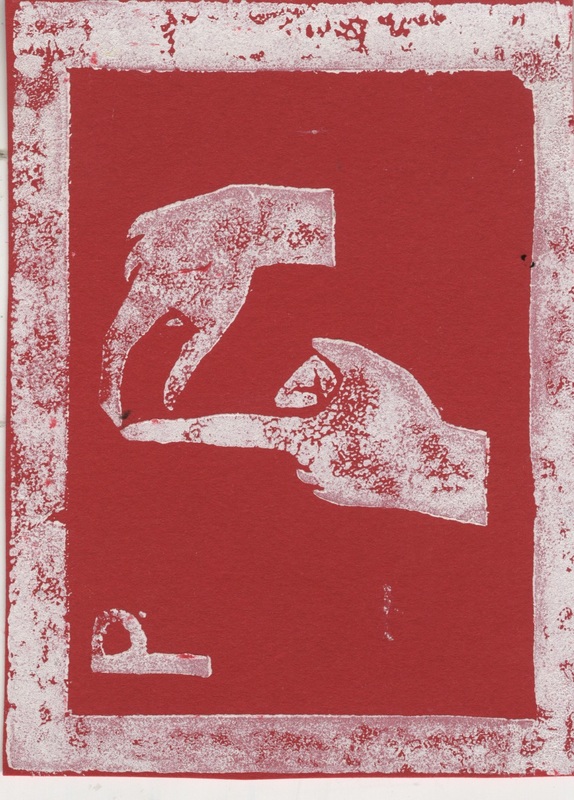
Above were prototypes of how to incorporate relevant paper mechanisms to the question words as seen in Oliver Jeffers book. The group were happy with my contribution for 'Why' and 'How', but found that 'When' lacked the right mechanism for the gesture. I went back to the book and thought that the 'flip-book' style mechanism would be more difficult to craft but appropriate for presenting the gesture needed to sign 'When'. I drew this digitally with inked lines to keep it uniformed with Yury's styled hands that he drew for the publication. The reason why I chose digital was because I found that it would save time by erasing and redrawing the fingers individually quick using layers in Photoshop rather than tracing each frame.

I also designed the book cover using prints of my hands and tried to keep the colours matching the inside of book, but to overcome all the contrasting colours, I changed the transparencies and overlays to digitally create a 'screenprint' style look where the colours change on top of each other. I thought this cover matched our colour scheme, showed a little fun and the idea that this publication is filled with hands for signing.  
 I liked Peter's suggestion of including acetate to the book, it made the cover a little more fun to play with, which works well because that was one factor we wanted our book to have of. We also received feedback of people enjoying our book and what it promotes. The only down-side is that some of the pop-up mechanisms would get stuck or were difficult to move. As a group we believed this was because of how small the book was produced which created more friction than a slightly larger book might had done. 
Preparing for our tableau, thinking about the gift and engagement requirements we all liked the idea of creating lino motifs of the alphabet for the public to engage with by printing their names themselves and then taking it away as a gift. Also to incorporate our earlier idea of bringing something digital to the event, Chloe was making animations of the alphabet with a code that can be scanned on the back of the lino prints so that the person can voluntarily learn more signing other than their name. Whilst the other three of us worked on the lino, Peter agreed to make some 3D hands influenced from the model table display to stand up and draw the public to our stand. We also agreed to continue the colour scheme from the publication by using only white to print with onto different coloured card that the public may choose themselves.
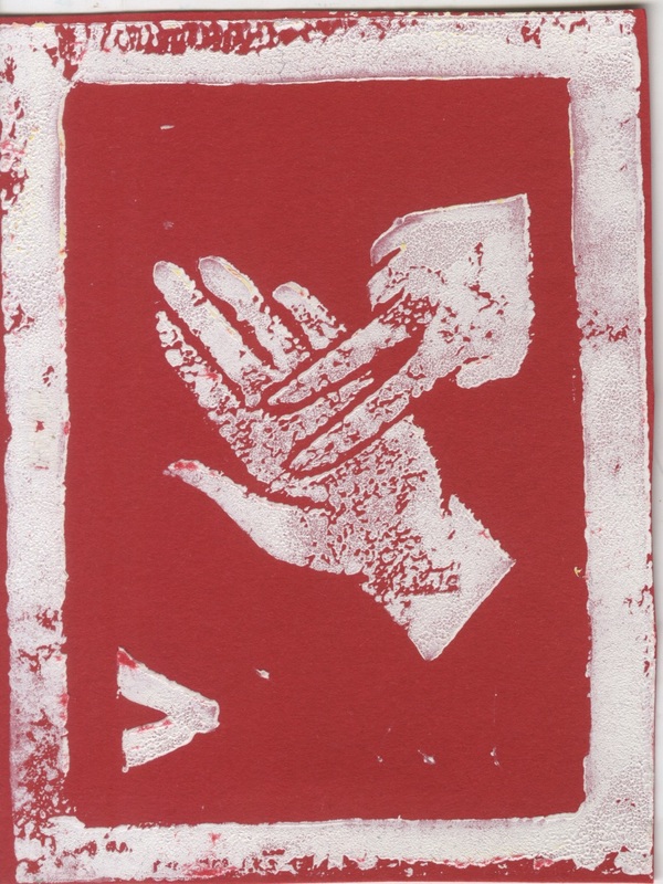
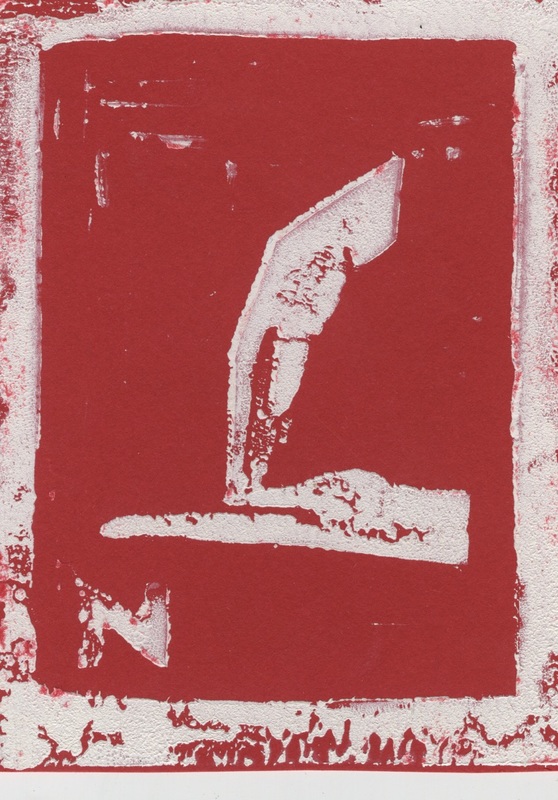
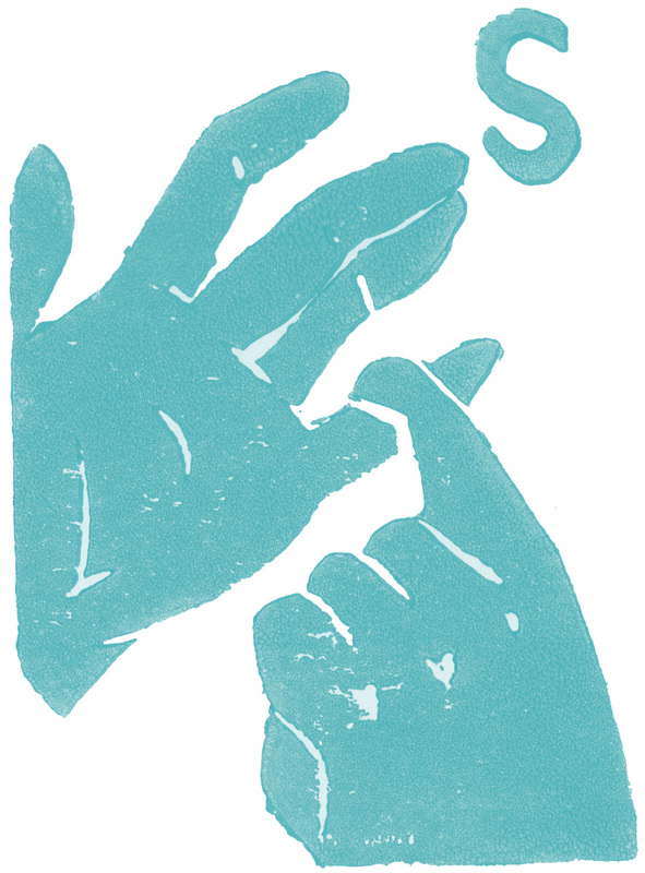
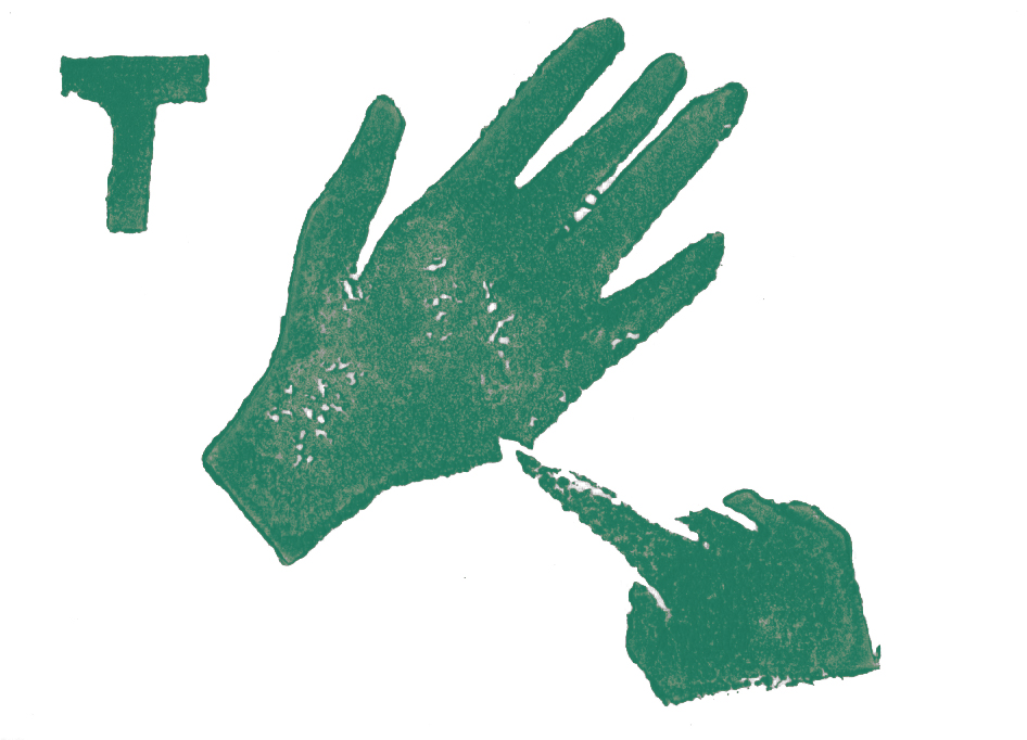
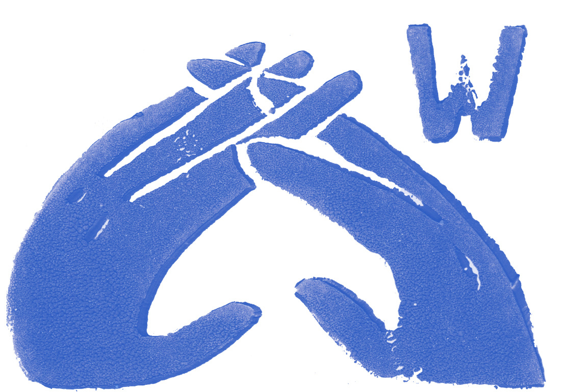
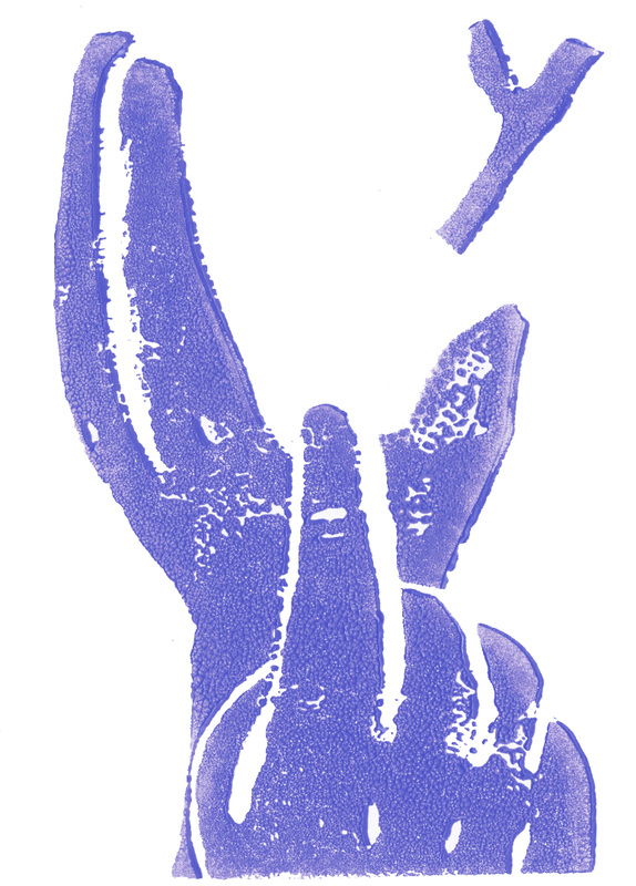
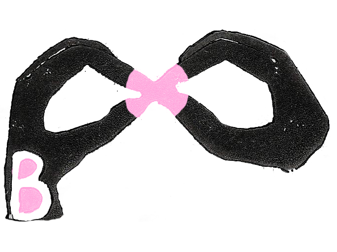
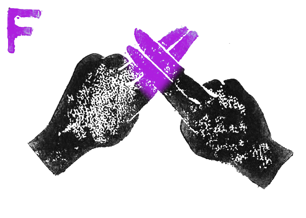
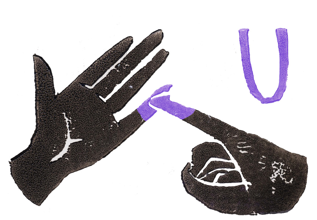
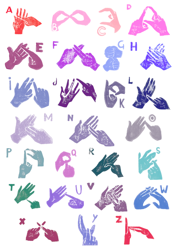
Between me and Jaz, we agreed to do 13 letters of the alphabet each, intervening, to spread out the workload. I worked upon A,D,F,H,J,L,N,P,R,T,V,X,Z. On the day of the tableau, we only had my 13 letters to display with but it still showed our incentive for the event. Lino printing and owning original prints is something I like doing within my practice because it can be used to make bold images but also offers the opportunity to create textures I couldn't make without it.


Chloe's animations and QR code to our blog containing them.
http://www.bslanimations.tumblr.com 
Today's feedback made us as a group realise that we had taken the concept of getting the public to lino print instead of learning what is BSL. This did cause a little panic because we were so adamant about lino printing that we all had to take a step back and begin another thinking process. Our table display was too distracting with all the colours and shapes from the table cloth that it needed simplifying down to a more uniformed style. The feedback showed that everything was working well individually, but they believed that we needed a balance of the lino print display and our previous interactive publication to exhibit.
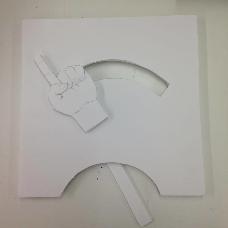
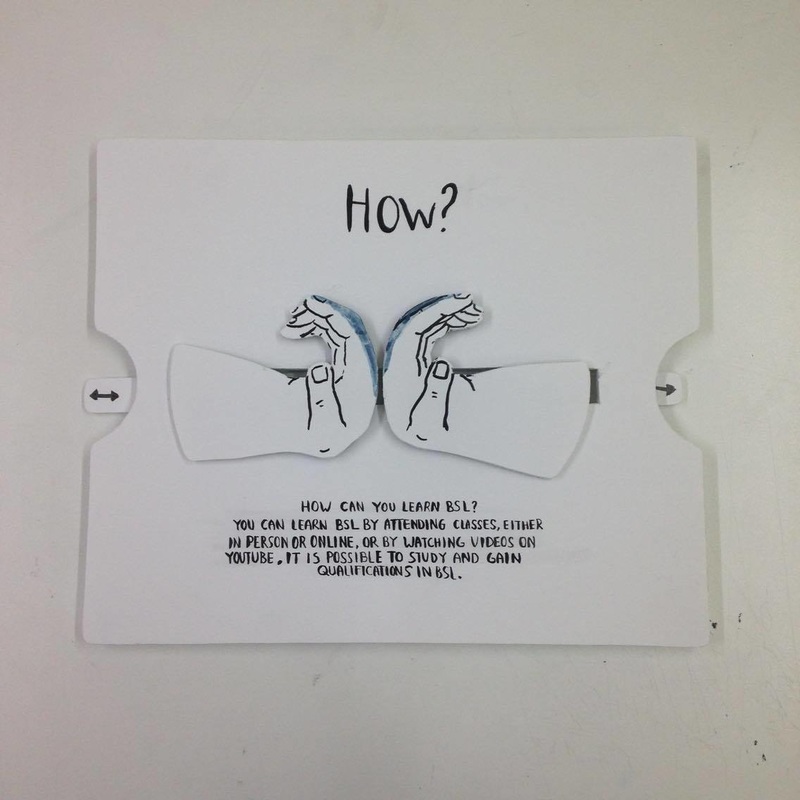
We decided we needed to incorporate the ideas from the publication into the display further, by including 3D elements into it. We agreed that we could still use lino print for our display by using it for the gift that we hand out on postcard-sized leaflets with our QR code and URL on the back still. Inspired by Peter's foamboard hands, I decided to try and re-create the pages in the book with this material to try and blend the two methods together. I crafted How and Why, whilst Peter did How.
 Peter's Mechanism for How.  Jaz's 'BSL' Lino Cut for our Postcards 
 We simplified our layout for the display, yet when Matthew came over spoke with us, it still wasn't quite working. There was no uniformed style yet, everything was individual. However it was recommended that we aimed to match Chloe's animation style, the general census of white with patches of colour. Anther aim was to create a more interactive and engaging table with the foam board hands. As a group we decided to incorporate our main subject, Linguistics, again and spell that out in sign language for the public to solve using the foam board hands.
We knew we had set ourselves a lot to do in a short space of time, so I wrote up this plan of who was doing what and when things needed to be done in order to progress on and be ready for the following Friday.

I re-made all three foam-board mechanisms as the previous ones weren't of the best quality and passed them to Chloe to paint so that it was in uniform to her painted animations. We also decided to put the information answering the questions about BSL onto the boards as well, following the idea of our publication further, with even the same typeface.  Printing Jaz's linocuts For the nine posters that were announced needing doing, I thought it would be a good idea to re-use our lino prints as it'll match the postcards and our past efforts weren't to waste. This time, in order to uniform them to Chloe's style, I used my digital Photoshop skills and printmaking to scan in the prints and edit the colours. I think these work a lot better as digital prints edited than the white ink on top of the coloured card before because it was tying in nicely with our new colour scheme.
Because of my confidence with using Photoshop, InDesign and printing at the design studio, I was left to work on the postcards and posters for our display at The Forum. Our colour scheme was very restricted to pastel blues, purples and pinks and so I made sure that our postcards had this same scheme as well, as well as the typeface we used in the publication and on the foam-boards.
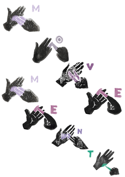
 Myself, Chloe and Peter worked together on composing the poster layouts. We wanted the centre poster to have the complete alphabet no matter what because we saw that as the foundation of learning all of British sign language. We also wanted to make sure that the top row acted like a title and stated British Sign Language. We were a little unsure what to make of the last 5 posters, but we looked back through our work and Chloe remembered about the yellow sheet where we wrote 10 key words relating to our theme, and so took the most relevant words from there. I had a little worry when first looking at the designs as they reminded me a little of blackmail clippings with the scattered letters and the blackness of the motifs. I was assured by the others that they don't because of the bright coloured centre piece and the colours themselves on the letters as well. Overall we were impressed with the final display of the nine posters and thought they were satisfactory as they were. They showed our concept and we were able to use our old lino prints again in a more suitable manner.

 The feedback we received from Fiona was a big improvement from the feedback we received shortly before Easter. We'd finally created a uniformed style that worked. There was a little re-arranging that needed to be done and Jaz thought of putting the alphabet poster, laminated onto the table for people to use more effectively when completing the puzzle. After that there wasn't anything further to do until the day. We were all pleased that we had managed to successfully create a table top display for the event that was engaging, creative, playful, and raising awareness about BSL.
|