|
My group's city location was the shopping mall; Chapelfield. One of the major points we spoke about together inside chapelfield was it was like it's own sterile city of consumerism. After speaking with the Information helpdesk, we discovered a history behind the shopping mall, about how it use to be a chocolate factory. We all immediately became fascinated by this and planned how to take this further. It was this that we all decided to go and research into a bit more detail about how the plot of land developed throughout time. We linked that this plot of land had been very consumerist, developing from a chocolate factory, which makes the products, into a shopping centre that then sells these type of products off it's shelves. 
0 Comments
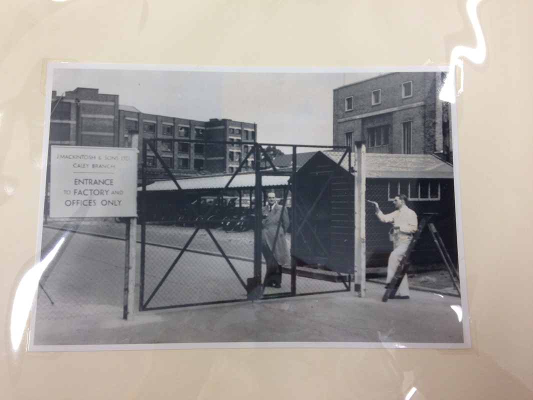
My visit at the Norwich Heritage Centre offered plenty of imagery to help us visualise what the factories used to look like when they were under different management. Owain also found old advertisements and newspaper cuttings at the archive, which provided a visual artistic representation of advertisement in the consumerism around chocolate in those particular years.
This blogpost was a valuable resource as it gave an in-depth, historical, overview about this particular factory and the different managements it went under, although it speaks most about Caley's, the original founders. We all found this a great insight about the history of the plot of land being very consumerist and decided to visit the local Bridwell Musuem as we were aware that they had collections about the old chocolate factory. Now that I'm aware of using archives as a research source, they're something that I've become excited to go into when I'm researching about local history and communities. Without knowing of its value beforehand, the possibility of discovering these memorabilia would not have had happen. Using archives is now something I'm going to apply to my practice regularly for research, as I find the jewels I would not think as easily attainable.
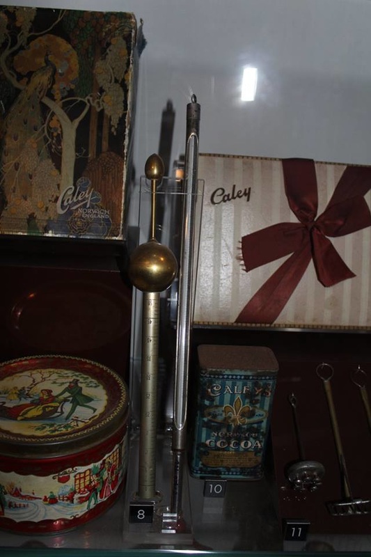
We saw a vast collection about the history of Norwich and its part in trade and consumerism, particularly with Caleys/Mackintosh chocolate factory. Thankfully, the volunteers at the museum were of great help with extra information that weren't on display. One major point we took note on when the volunteer was providing us an in-depth tour mentioned that whenever she used to visit the city, all you could smell in the air was chocolate. This tiny detail made us realise how important this chocolate factory must had been to Norwich's identity, and this was proven with the collection available to view in the Bridewell Museum.
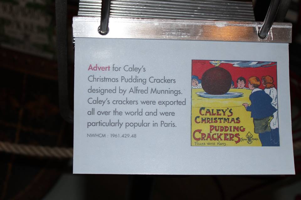
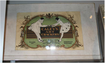
The discovery about Alfred Munnings providing a lot of advertisement for Caley's provided more artistic information about how we could go about creating an installation about this chocolate factory.
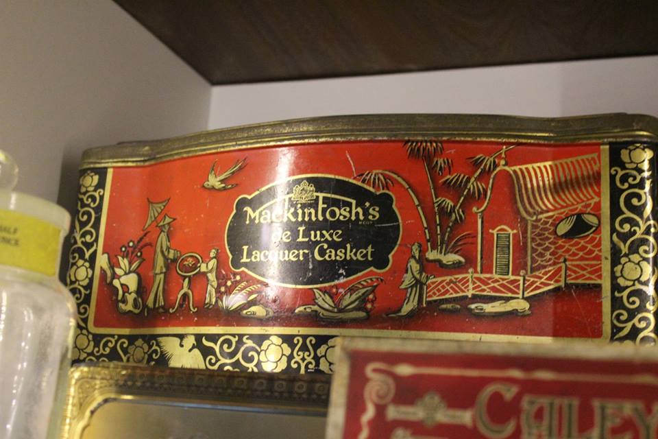
Further investigation to caleys and mackintoshs package designs. I noticed that with consumerist products, that branding the packaging with the name was a vital aspect. 
We discovered more about the desperate campaign to keep the factory from going in the 90s. This proves more to our point about how this factory was a key part of Norwich's identity in the past 100 years. Due to the failure of this protest, Norwich gained it's new aspect to it's identity, Chapelfield, which created another reasoning for people to visit the city that don't live near big-branded shops. We noted that this plot of land had provided the manufacturing production of consumerism, and is now providing the selling of consumerism today through Chapelfield.
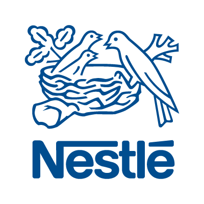
Our tour guide also mentioned that one of the reasons why we associate canaries with Norwich is because in the factory they used to have caged canaries to listen to them sing for entertainment. This led me on to notice that the branding of birds had played a role throughout the land's identity as birds are also logos for the brands Nestlé and Intu. I think this could be developed further for creating a visual link between the history of the factory and current shopping centre.
I developed the idea of experimenting with chocolate further with the idea of branding and creating a historic identity logo for Chapelfield in my head. I thought by using chocolate I'd gather that same authentic smell that the tour guide spoke about when visiting Norwich.
I felt like I captured the essence of Caley's typography and created my own twist to develop one for Chapelfield, however I'm unsure how to use these designs to create a final outcome. I think these need more development to show the consumerist links with Chapelfield and the chocolate factory.
The tiled chocolate bar instantly reminded me of tiled flooring which is seen inside Chapelfield. Re-creating the tiled flooring gave me a sense of creating a foundation that the chocolate factory had created for consumerism on that plot of land. When we walk in Chapelfield, we're walking on the remains of the old chocolate factory.  Kimberly's photograph creates the abstract illusion of us walking on the remains that the chocolate factory used to stand upon.
Using Ryan's photos, I attempted at manipulating them in order to visually show the concept of the combination of the links between Chapelfield and its chocolate-making history. These to me resemble the designs made when marketing how a building will look when 100% completed and in use. I feel that these could be used to create representations as to how a re-design of Chapelfield when incorporating it's history if we were to create a final outcome based on that concept.
As a concept we decided to look into creating postcards as we thought they displayed a historical context and the tourism effect that Chapelfield brought to Norwich. From our feedback, it appeared the idea of both consumerism, historical and tourism was a lot to try and work from, and needed narrowing down. Narrowing it down to just Consumerism's two aspects of manufacturing and selling was the right idea to follow as it's what we've been following throughout.  A rough proposed plan for layout showing the evolution from manufacture to consumerism.
  After feedback, I attempted to create manufacturing collages of the past factory that showed the element of the chocolate. These were originally DIY scratch and sniff, however that aspect didn't work effectively, although they did smell strongly of chocolate on their own.
I believe these capture the essence of our concept, however, creating these types of collages isn't something I enjoy. I felt a bit like a cheater using already made images and incorporating chocolate onto them. I think if I spent more time on these than what was available, I could had created a silhouette of the factories and workers based on the resource images. I think this would had created the same effect as these and I'd feel like it was more of my own work. Being confident with InDesign, I designed the layout for the publication using the manufacturing and consumerism images the group had contributed. We believed the pages either side of the spine in a spread added to our concept of the two halves of consumerism. The left hand side represents manufacturing in the factory and the right hand side represent the corporate selling within Chapelfield.
We agreed for choice of paper to be Biscuit Eco as we felt it had that same grain effect that the advertisement had that we saw of the Bridewell Musuem.      
Setting up for the final exhibit, proved that our idea from the floor up onto the wall didn't speak our concept as effectively on paper. We decided to go back to our initial ideas of how consumerism is a circle continuing, manufacturing -> branding -> profits -> manufacturing etc.. We still implemented the concept that manufacturing is the foundation for the consumerism on the Chapelfield location by having those images along the bottom of the circle, and the corporate consumerism of Chapelfield along the top, blending in together.  Final Piece at the Exhibition This project gave an insight into the reality of collaborative projects on a short time scale. It was very difficult to organise all together at the same time, but we managed it in the end. I did feel that I may of taken a slight initiative approach to the project by directing people what we could do for our concept. I think because of the short time frame, I wanted to make sure we were secure for keeping onto time when researching and creating.

I signed up to this session to improve my drawing skills. I hadn't looked into perspective drawing since high school and thought I needed this session to have another chance at understanding perspective. I'm glad I attended this session because it reminded me of thing I had forgotten and taught me new about perspective as well. I really enjoyed creating the 'fish-eye' work. I felt that it made my work look more dynamic which I feel that my work lacks a lot of. With the 360 degree room drawing, it's a lot more fascinating to look at than the usual square corners I probably would had drawn if not told so. Recently I've been looking at artwork and seeing how and if they've incorporated dynamic perspectives as well to see how effective it is at creating an exciting piece of work.
 
 I really enjoyed my session with Textiles Course Leader Nicholas Rodgers. I had never known of the software AVA before and found it a really useful tool with repeating and colour swaps. One of my favourite features was that you could automatically repeat a pattern to my customs, and still work into it to make it loop like I had done above with the cat and squiggles images. With the Tucan image, I learnt how I could take an image and separate all the colours I pick from the original and transfer them to layers. It gave myself a lot to play around with and develop to create these bright repeat patterns above.
I thought about how I could use this software to develop digital patterns for when I create digital illustrations. Above is an old sketch and I incorporated my patterns to use for the bikini. I think this would be a really nice way to create flat digital illustrations when it comes to clothing, or maybe use it to render repeating textures that can then later be used. This is a software I hope to get the chance to use again in a future project because of how fun and adaptable I find it can be.
|


.jpg)


