  
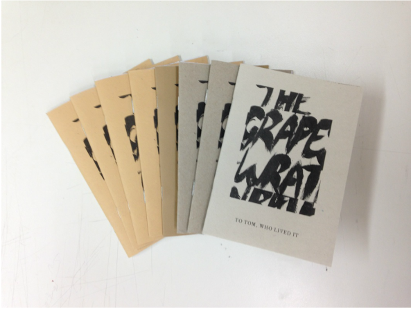
For our Zine, we individually created 8 images each based around the themes of The Grapes of Wrath, such as the drought, the journey and hobo symbols to represent the crisis the book is set in. We also chose our charity to be Refugee Action based here in the UK.  
We had a practice run of how to present our piece for the exhibition. We agreed that the suitcases were the best method to display our theme of migration. We blended the two different tableau ideas we did with the objects inside the suitcases themselves, placed appropriately for viewing as if being documented. We wanted our work to encourage public interaction, therefore we incorporated an amp playing our sounds within a suitcase to attract the public closer, and with the flaps closed to entice them to open and find out the contents themselves.
As we talked more about our thoughts of our theme of the migration the Joads took over to California set in the 1930s, we realised this was always a reoccurring theme throughout history that still happens today. We thought it was very relevant to the current refugee crisis across Europe with refugees arriving from Syria. We took this as an opportunity to make our work relevant to both the novel and the current crisis. We agreed that it'd be a good idea based on the Charlie Abbots zine making workshop to create and reproduce a zine beside a donation jar, with all donations going to a chosen charity that helps the refugees.
Having two musicians in the group was fortunate as we managed to achieve some lovely music to comply our theme of journey across the mother road. We also incorporated the sounds that the leather suitcases made. Overall the sounds we created felt authentic to our theme of the book and believed it'd be a shame to not include them in our final creation.
 The 3D tableau developed our thinking further about our theme and the possibility of our final outcome as a 3d installation piece. The suitcases became a strong focal of our work. We felt that they effectively represent our theme visually due to the connotations of travelling they deliver. We also saw the suitcases as a metaphor for the running theme of the Joad family and its importance within the novel.  We even tried taking it at an archaeology point of view as if these objects were found and displayed. This was an experiment on a different angle as another possibility of how we could display our final outcome.
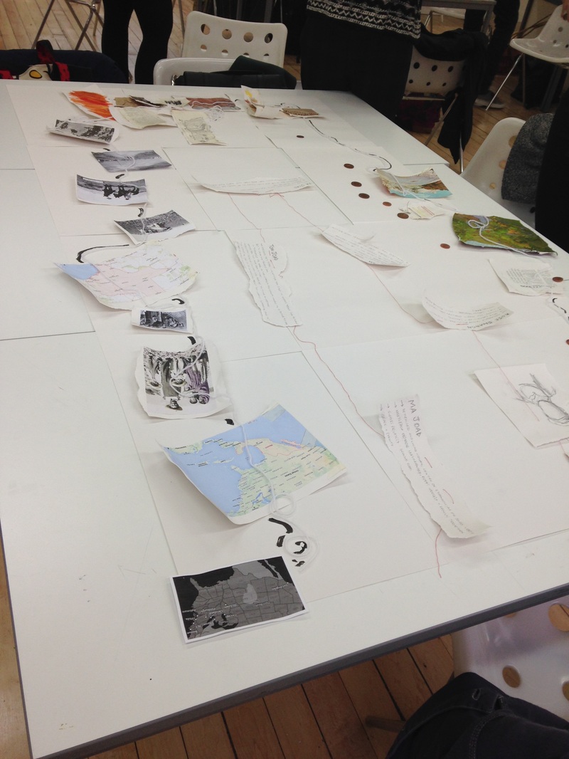 For our initial ideas for Grapes of Wrath, we began thinking about the themes of journey/migration. We thought that this was the major theme of the novel as the Joad family took the dedication travelling from Oklahoma to California.
After my review and a talk with John Gray, I decided to research 1960's book covers that have text in a vertical direction to parallel my image. I found these two designs and they inspired me to attempt playing around with typefaces again in a more bold sense.
 I've chosen the final image as my book cover as I felt that I captured the right composition I was after and I find that the bold typeface reflects the 1960s period as that's when the short story was written. I attempted moving the shadow of Ned to play around with compositions with text and image, however I feel that the last one works best because of how they parallel each other.  During the review I knew why the final page wasn't working as soon as the group pointed it out. I needed to change the angle and knew that a bird's eye view angle would be best for this moment because it would highlight Ned's loneliness which is what I wanted to represent at the end.
|


