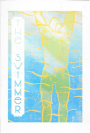
I think my review went rather well. Everyone understood my angle of showing the progression of seasons and time alongside Ned's actions to represent his emotions. The two key factors that the group pointed out was the front cover and final page. The final page had a very similar composition to the first page and Ned had only coloured outlines compared to the other pages which I hadn't noticed I'd accidentally done. As soon as this was mentioned, I had thoughts of different angles and positioning of Ned for the final page which would represent and highlight his loneliness and sadness at the end of the story. I thought about making him really small in a large empty space, I also thought of angles perhaps from the feet looking up at the winter constellation but I thought this would be too similar to the page beforehand. I knew my front cover needed work badly and it was noticed that I was trying to make the text fit with the image instead of the image and text working around each other. I think choosing the right cover is what's going to be difficult for me because I like the image as a cover as it deceives the viewer that it's quite a pleasant story as I felt when reading the first few paragraphs of the story, however it might mean I need to create a new image in order for the text to work with it.
Designing an effective front cover proved to be a challenging task for me. I tried to use a 1960s stylized typeface and different orientations yet I'm still not pleased with any of them. I've always found composing text and image together a difficult task as I even reflected upon a situation similar to this in my Reflective Report from first year.
When visiting lecturer John Gray looked at these different covers after my review in November, he felt that the title should be parallel to the figure however I need to experiment more with text and making it blend with the image. 
I enjoyed making these prints and then manipulating them in photoshop to combine different prints to achieve the right effective colours. Using water-based printing ink, I still got a textured effect, which I wanted, influenced from Bramblitt's paintings and the 1960s pop style influence.
  I decided that I should show Ned's emotions and body language that corresponded with the weather in the same frame, to highlight this connection. I also wanted to ensure that my angles were different to my plain birds-eye ones that I had originally done for each page beforehand. I thought drawing some close-ups would add more dramatisation and express Ned's body language more effectively.
Lucinda River - Screen Print - 2015Whilst looking for initial research photos for The Swimmer online, I found these select illustrations by Enzo Minarro. I don't want to copy his interpretation of The Swimmer, however I felt that we were both influenced by how the environment represents he emotions running in Ned's head. I also love that Minarro has used a 1960s pop style to illustrate the story considering that the short story was written in the 1960s. I was struggling with choosing what medium to use and the influence of 1960s pop art inspires me to try Lino Printing as it's a medium I do enjoy making prints with.
I fell in love with these paintings by blind artist John Bramblitt that I came across. His paintings are expressively textured and strikingly colourful which I feel that my work for this project should express also. Expressing colour feels essential for my work for this project as I've highlighted how important the weather is in the story in correspondence to Ned's emotions.  Influenced from my Eaton Park pictures and Bramblitts expressive paintings I decided to try a different medium, acrylic. I feel that using this style, I managed to capture the essence of the water ripples distorting the weathers reflection which was something I didn't achieve with oil pastels. This could be a medium I use to develop my final pages if I feel it expresses my thoughts the best.
Eaton Park from Gemma Aylward on Vimeo.
In order to get a better understanding of water and how it reflects a distortion of the weather I decided to visit Eaton Park's boating pond over the period of the sun setting. I feel that this trip help me realise the right colours to use and how the water ripples reflect the weather.
When I initially read The Swimmer, I became aware of the pathetic fallacy between the main character and the weather. I also noticed how when time progressed over the day, their was signs of the year progressing too from summer onto winter. This was what I wanted to illustrate for the short story, the progression of the character and the journey during his life which is represented from his environment and the various neighbours he visits.  My initial development work was based solely on images online and I only worked in oil pastels which limited these outcomes heavily. I took the approach of the weathers reflection in the pool water however it felt that oil pastels was a wrong medium for this as it couldn't capture the mirroring effect. The bird's eye view angle wasn't working either as I found it very bland to look at each page from the same plain perspective, the same with the closing borders I experimented with. I felt that these didn't represent the progression of a story coming towards its end as I thought it might and decided it wasn't needed. I feel that in order to develop further, I need to have a better understanding of how water does reflect the weather in order to capture it myself.
|